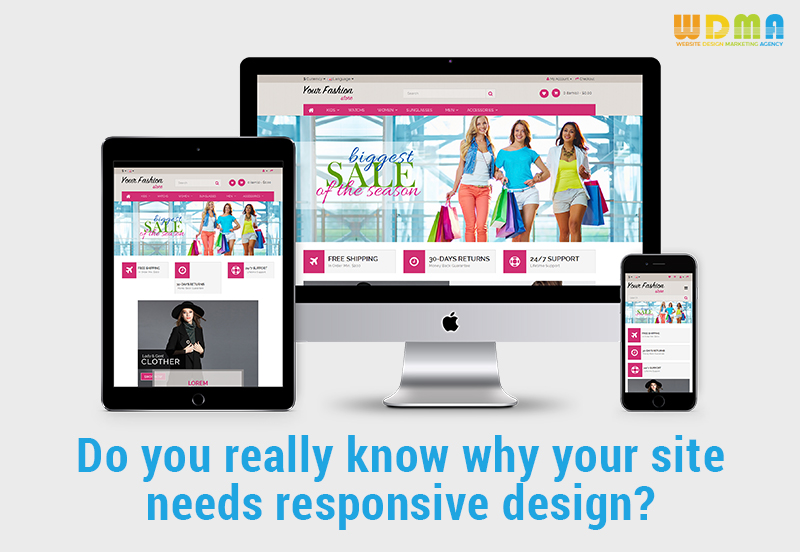
Do you really know why your site needs Responsive Website Design in Halifax, Nova Scotia?
It is impossible not to notice just how fast mobile devices spread around the world. Today, there are numerous sizes of tablets and smartphones, ready to suit the needs and preferences of every user. And things are not going to stop here, as it is expected for the mobile sector to grow even more, as various companies compete in providing the best devices people can buy. So, having all these in mind, it is obvious that website owners have to do something about it. With so many people using mobile devices, they have to make sure that their websites are easily accessible and presentable regardless of the size and type of the chosen device. This is where Responsive Website Design in Halifax, Nova Scotia comes into the scene.
- What is, after all, responsive website design?
The responsive website design allows a website to be used in a proper manner by any type of platform. For example WordPress, OpenCart, and Magento in other words, it doesn’t matter what brand or size of the mobile device you will own, because you will be able to access a website with responsive design fast and easy.
- How did everything start?
Everything started around 2004 when the first mobile devices that were browsing the Internet appeared. Web designers decided to come up with something that will enhance the experience of users online, by creating sites that are flexible and fit on screens of all sizes.
- How did responsive design become so important?
If we think about the fact that at the time 2016 was ending, 50% of Internet users were utilizing mobile devices it is easy to tell the direction in which we are heading. Today, a website risks being ignored if it doesn’t provide a responsive design, as visitors may consider it inconvenient. If you need more reasons to choose the responsive design, here are quite a few:
- It inspires trust
Yes, Website design in Halifax, Nova Scotia is important. Poor website design will make people not trust a site so do think about this when creating your website. For this, you don’t have to opt for complicated website design. A responsive design that is simple and user-friendly will definitely look trustworthy.
- Will improve the site’s ranking on Google
Google noticed that there are many mobile device users out there and it considers them very important. So, it will use responsive design as a new criterion to rank websites.
- User engagement will increase
A site with a responsive design will definitely improve your site’s bounce rate, appearing more inviting to visitors, which will want to see what more can you offer. If they leave after just a couple of seconds, more certainly your site is boring and does not meet the latest standards.
- Makes people want to follow on social media
Social media networks already have launched their mobile apps, so that people can use them wherever they are and whatever they use. A site that has a responsive design will allow people to share its links this way, sharing the news and increasing the engagement of your website.
What makes the responsive design so different from all the rest?
- Flexible images
An image that is oversized will always take too long to load. But when the images will adapt to the screen size of the device, the experience of the user will definitely be much improved.
- A layout that is fluid and columns that are adaptable
This means no more cut-offs from a webpage’s content, regardless of the type of device you are using. All the user needs to do to enjoy the info is to scroll down and up on its device.
- Easy navigation
Navigation bars will adjust together with the rest of the site’s features, depending on the screen size of the user’s device, keeping its attractive appearance and functionality at all times.
- The readable text
It is rather unpleasant to zoom in order to read a text or to bring the device close to your eyes to see what is written. Responsive design will not just adjust the format of a web page, but also the font, to make reading more comfortable.
- Viewing of video content
Videos are appreciated by everyone, but they will have to adjust to the screen size of the devices, otherwise, they will not be watched that much.
- Links and buttons
Both buttons and links will have to be larger and better positioned when we are talking about mobile device users. Otherwise, they will not be seen and will become useless. Responsive design takes care of this aspect, helping with the improvement of your conversion rates.
If you are looking for any consultation in Responsive Website Design then you can give us a call at +1 (855) 984-1577 or you can drop us a mail at info@websitedesignmarketingagency.com.